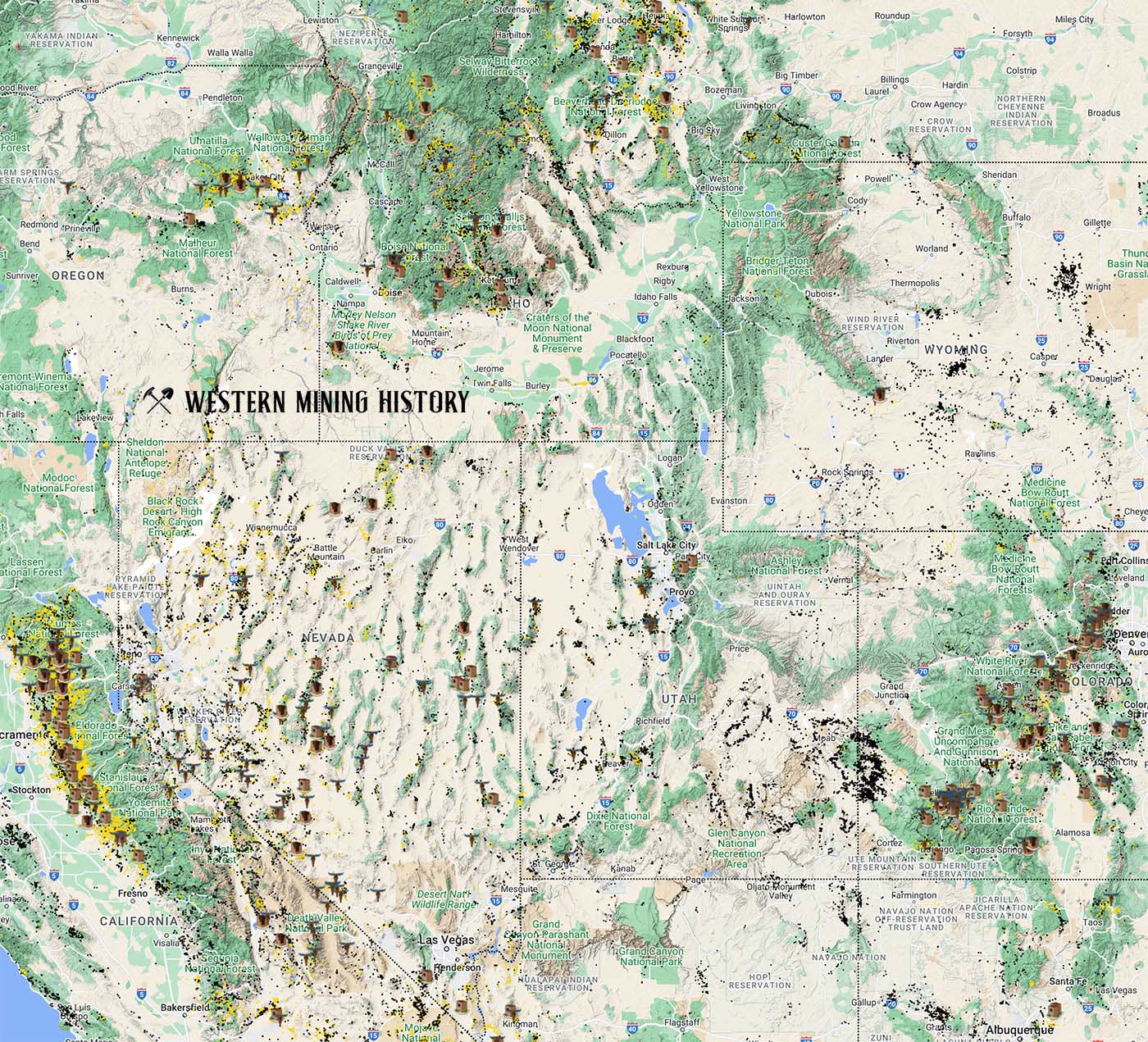
The image above illustrates the incredible scale of the mining regions of the western United States. Yellow dots are gold mines, black dots are non-gold mines. Map icons show the distribution of historic mining towns. An interactive version of this map is available here.